
Overview
VoyaGo is a travel planning app I designed for my MEJO 581: UX Design & Usability final project. The goal was to create a digital experience that makes trip planning less overwhelming by bringing inspiration, budgeting, and group coordination into one place.
Role/Team
Role: Solo UI/UX Designer
Course: MEJO 581 – UX Design & Usability
Tools
Figma
Timeline
October 2024 – December 2024
Problem Statement
Planning trips with friends is stressful because information lives everywhere—TikTok links, Pinterest boards, Google Sheets, booking emails, and group chats. It’s hard to keep track of dates, prices, and decisions, and usually one person ends up doing most of the organizing.
HMW
How might we create a digital experience that helps users build personalized travel itineraries quickly and easily?
Goals
The goal of this project is to create a simple, collaborative tool that helps travelers organize their trip details, manage expenses, and collect planning ideas all in the same space. The app should feel easy to use, support group planning, and make the process less stressful from start to finish.
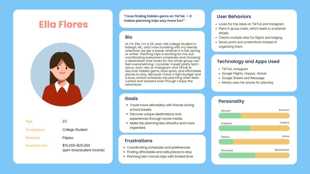
User & Persona
VoyaGo is designed for Gen Z and Millennial travelers who love planning trips with friends but often feel overwhelmed by having information in too many places. My persona, Ella, represents young travelers who are busy, on a budget, and usually take the lead in organizing group trips. She finds inspiration through TikTok and Instagram, but keeping track of links, dates, and costs across group chats, booking sites, and spreadsheets becomes confusing. She needs one place where everything for the trip is organized, easy to update, and simple to share with others.
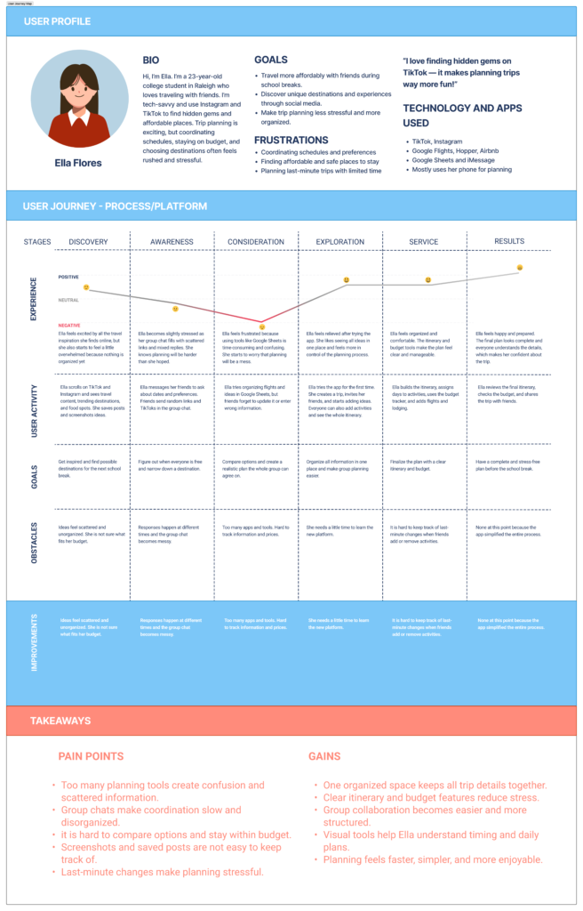
User Journey Map
Design Process
Research & Insights
I started with interviews and secondary research on how young travelers plan trips. I learned that people constantly switch between apps, lose links, and struggle to keep everyone on the same page with costs and dates. These findings shaped my user story, task flow, and journey map around a traveler like Ella trying to plan a group trip on a budget.
Flows, Wireframes, and Assets
From there, I mapped out the user task flow for creating a trip, adding activities, and checking budgets. I created low-fidelity wireframes to test structure first, then moved into high-fidelity screens with branding, icons, and layout refinements. My asset list helped me stay consistent with navigation, page types, and component styles as the app grew.

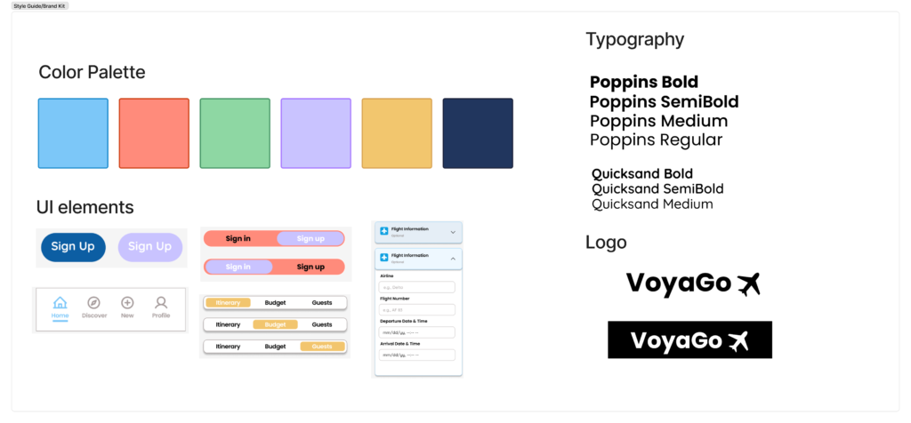
Brand Kit for VoyaGo
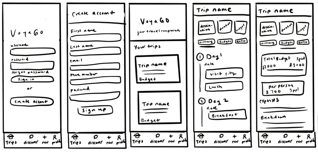
Low-Fidelity Prototype

High-Fidelity Prototype
Login Page
- Allows users to log in or sign up using a simple, welcoming layout.
- Uses brand colors and logo to set the tone of the app.
- Leads directly to the user’s saved trips after signing in.
View Home / Dashboard
- Shows trips as photo cards with destination and dates.
- Plus button lets users create a new trip quickly.
Trip Page
- After choosing a trip, users can switch between three tabs:
- Itinerary: Add and organize daily activities with notes and costs.
- Budget: Track total spending, remaining funds, and cost categories.
- Guests: Invite friends and view who is joining the trip.
Make a Trip
- Simple form where users enter destination, dates, and budget.
- Option to personalize the trip with a title, photo, color.
Discover
- Search activities and attractions, view images and short details.
- Add inspiration directly to the itinerary.
Settings / Profile
- View personal information, update profile, and access app settings.
User Testing & Iterations
To evaluate the usability of VoyaGo, I tested the prototype with three users. They were able to navigate the app easily and liked how trip planning was divided into Itinerary, Budget, and Guests. They also appreciated using the Discover page to find activities instead of saving scattered links.
During testing, users shared that:
- They want more details and photos before saving activities to their trip.
- Budget information should be even clearer, especially for cost categories.
- In-app messaging did not feel necessary since they already communicate through existing group chats.
These insights showed me that successful travel planning tools should make organization easier without repeating features users already have.
Conclusion
VoyaGo aims to make group travel planning simpler by organizing inspiration, budgeting, and shared decision-making in one place. Testing the prototype showed how important clarity and information-sharing are for users. Small improvements, like activity previews or clearer budget visuals, can make planning feel less stressful and more enjoyable. This project taught me how design decisions should be based on real user needs rather than extra features. VoyaGo has the potential to grow into a true travel companion, supporting users from their first idea to a fully planned trip.
Next Steps
If I continue improving VoyaGo, I would focus on:
- Adding more detailed photos and descriptions to activity previews
- Enhancing budget visuals with clearer cost categories and splits
- Polishing the visual style to feel more product-ready
- Conducting additional user testing to validate improvements
These future iterations would help VoyaGo become a more reliable and stress-free tool for planning group trips.